i can only afford one design, a sheet of 20. one idea i considered was the underwood logo Richard liked so well.
of course you can make your own too, this zazzle seems to be the only one of the four outfits that allows text, unless i just didn't see it.
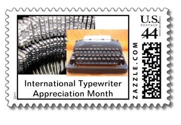
The typebars are from the underwood noiseless I got from strikethru, and the SC Clipper is from Retro Tech Geneva

I prefer #1, though if there were ever a good reason to use a monospace font in a design, this is it...
ReplyDeleteI didn't find any font options. I'll look again when i pull the trigger.
ReplyDeletefunny though - i made the portrait one because the landscape seemed crowded to me.
I like #1 as well.
ReplyDeleteThey're both good, I like the whole concept!
ReplyDeleteLooks great; my vote would be for #1 too.
ReplyDeleteI like both but #1 wins for me.
ReplyDelete#1, and nice idea.
ReplyDelete