Total Pageviews

progress

Saturday, September 17, 2011

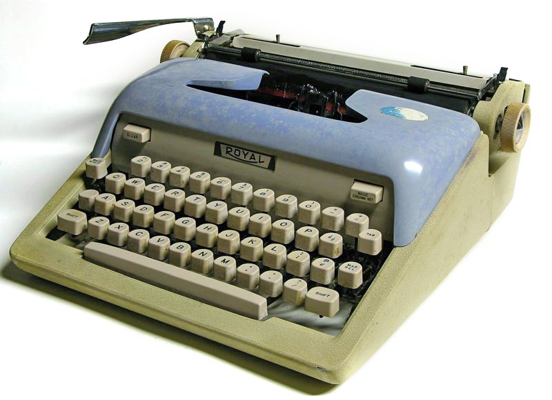
royal typecast at the fair

Western Washington State Fair, Puyallup.


just like this but labeled ALL-AMERICAN


Sunday, September 11, 2011

sunday in the park with Olivetti

The elite reads: "Ok I know.  I wasn't going to buy any more Japanese-made machines.  Too new, too hard to pin down a date, not enough written about them. But this AND the Stenograph for $6 was too low to pass up."


This one has a stand!

Same size as the Brothers I used to have, and feels very similar

Friday, September 9, 2011

SM4 with Olympia Congress typeface

rock-hard platen.  Something must be done.

interesting effect.  I like it.

Thursday, September 8, 2011

so busy

good luck following this mess...

Started Tuesday, not finished until Thursday (and not really finished either).
I just deleted an entire paragraph.  I wonder why I'm so reluctant to talk/write about myself?

So what I had been saying was that taking the GRE put me on a mailing list.  I've heard from 4 colleges so far but they don't seem to have really looked at my records, and since my scores are still months away they can't have those yet either.  They are just touting their programs so far.  As they are all far away I'm not going to ask for any more info.  I don't want to go into it without a scheme for the outcome.  Still, it's interesting.  I suspect application fees are a revenue stream?  Anyway the trickle of ads is a little upsetting since I don't want to miss it later if I'm actually sought after.  Do they do that?  If not I'll chuck them all.  What I really want is to decide which societal problem bugs me the most and try to get education/work fixing that.  I need to start analyzing my feelings on that.

On the NaNo front, I'm proofing my book for createspace publication.  If I can do it this year I wondered if it really has to be a "novel" or can I write nonfiction this time?  I mean I'm sure the upload doesn't care, but do the organizers or other participants? 


'

Sunday, September 4, 2011

screen caps of type-ins


type-in saturday

I was on G+ several times Saturday, got to chat and type with Adwoa (twice) Elizabeth, Richard, Ted and Tori. I also snagged Mike in PDX while he waited at the car repair shop.
Here are the things I typed at noon.  The first is a test of a $5 shopgoodwill buy, another studio 44.


And this is what I typed at the midnight session with Ted and Tori.  I had the two Letteras downstairs for that one.

Thursday, September 1, 2011

lettera 22 and 32 comparison

I managed to find a Lettera 22 in normal type to go with my 32 in script.  Now I can do a little comparison.  
First, we see their profiles are similar but not identical.  It's hard to see in the photo but the 32 has a downward slope toward the rear, and the 22 has a smooth finish.  My assistant, Beaker, stages the photo:


Here we see the difference in typebar and ribbon arrangement.  The 32's downward slope is made apparent by the angled spools.


At the left end of the carriage numerous differences can be seen in the mechanical arrangement.  It would be interesting to see some discussion by experts.


I shot the left end at this angle to show the marked difference in the carriage by means of the cutout opened for it.


This was interesting to me.  I pressed the Q key.  The 22 pushes the first link forward, (and is prone to double-strike skipping), while the 32 pulls back.  Despite all the differences, they feel remarkably similar to type on.

I measured these at 11.5 per inch.  also interesting...


Followers

Blog Archive